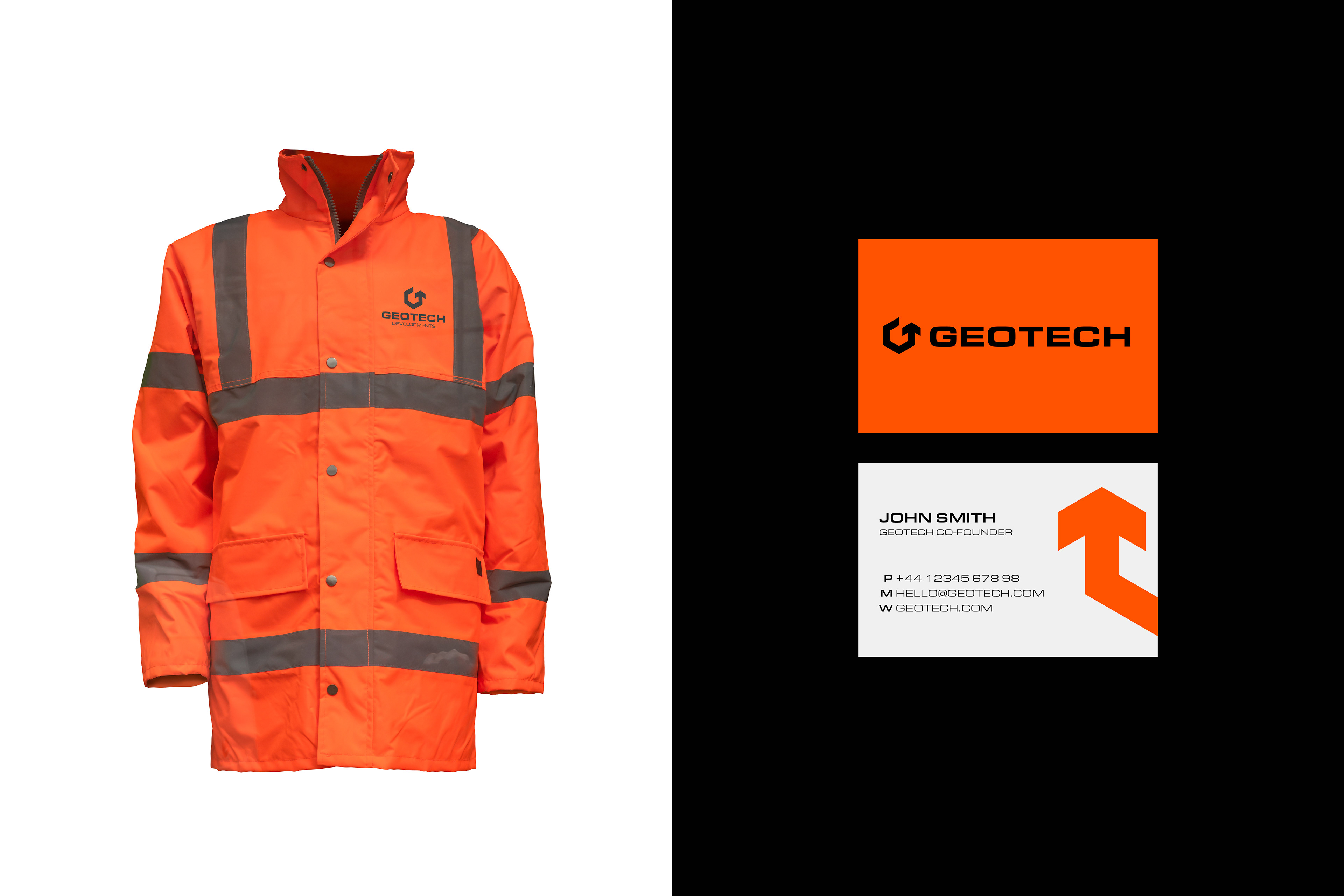
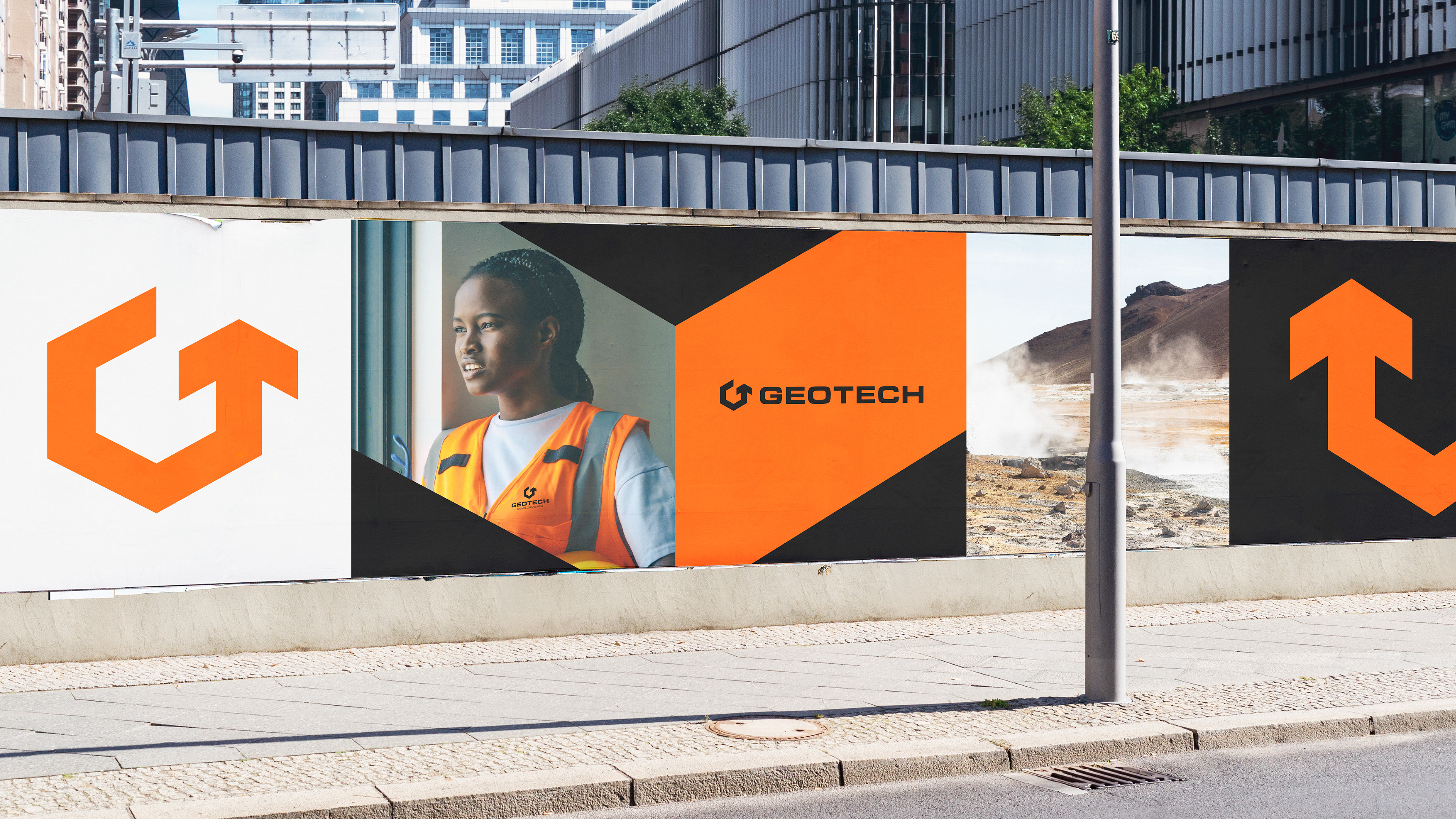
Client: Geotech
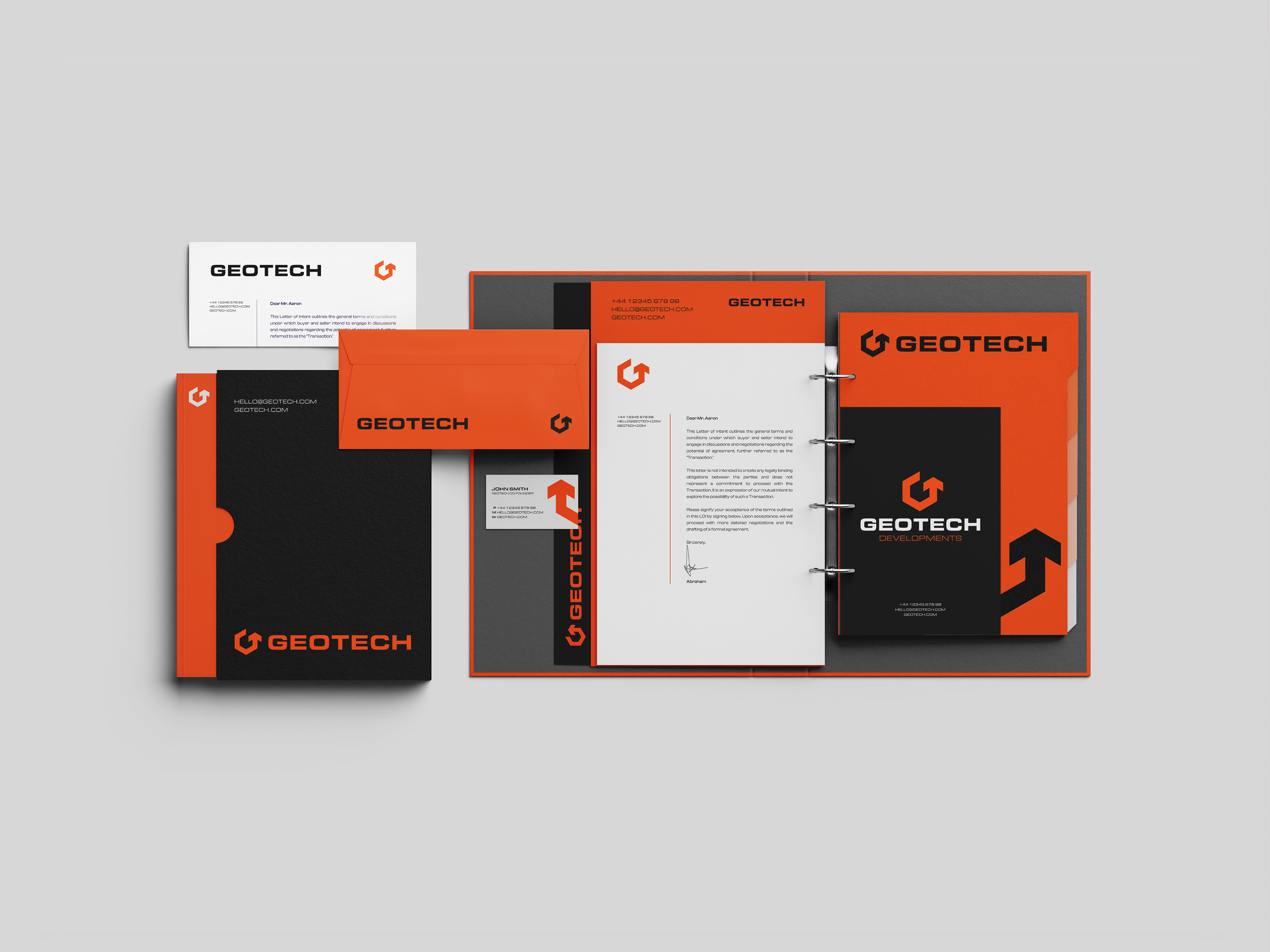
Scope: Logo design / Branding / Visual identity
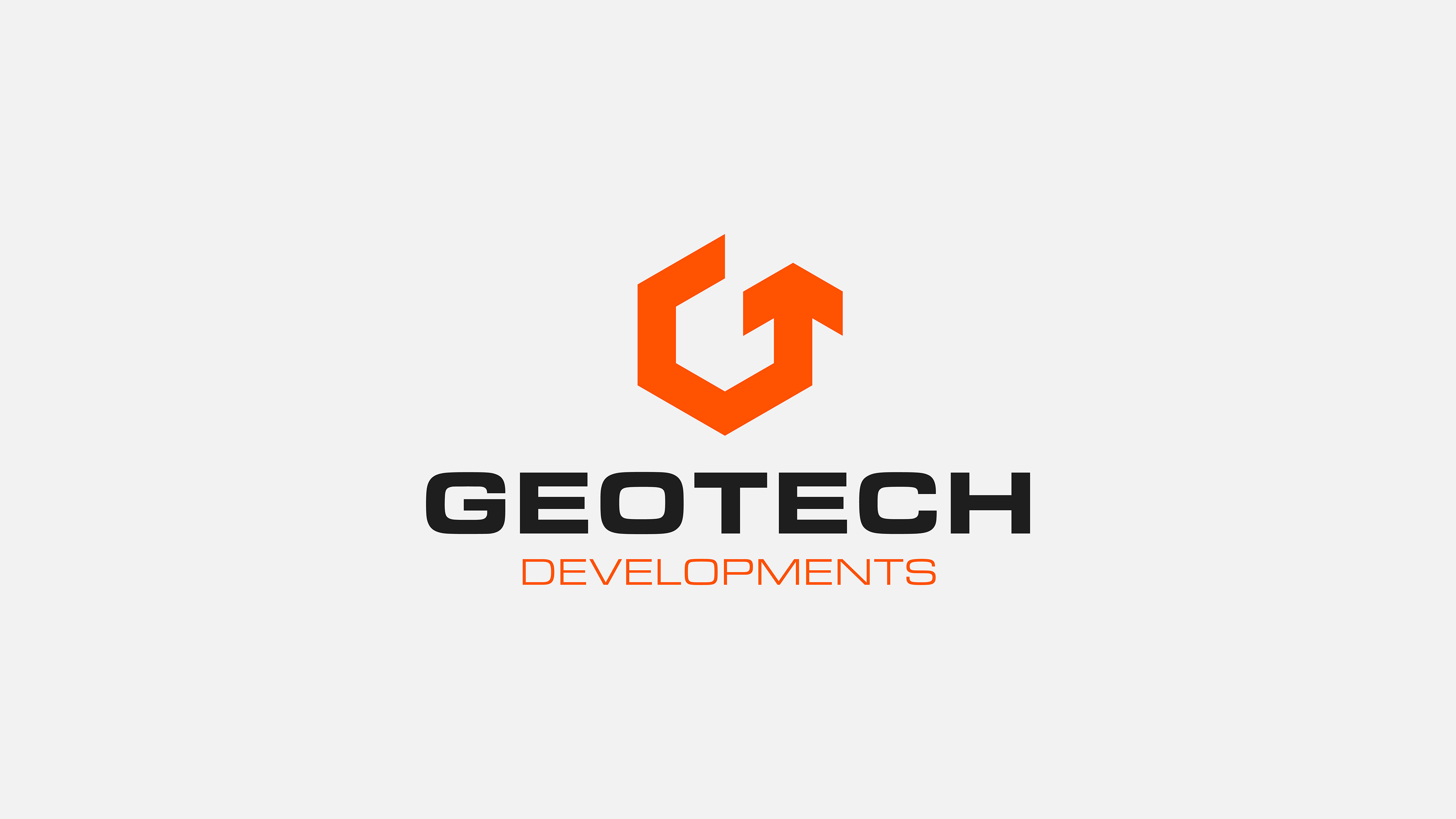
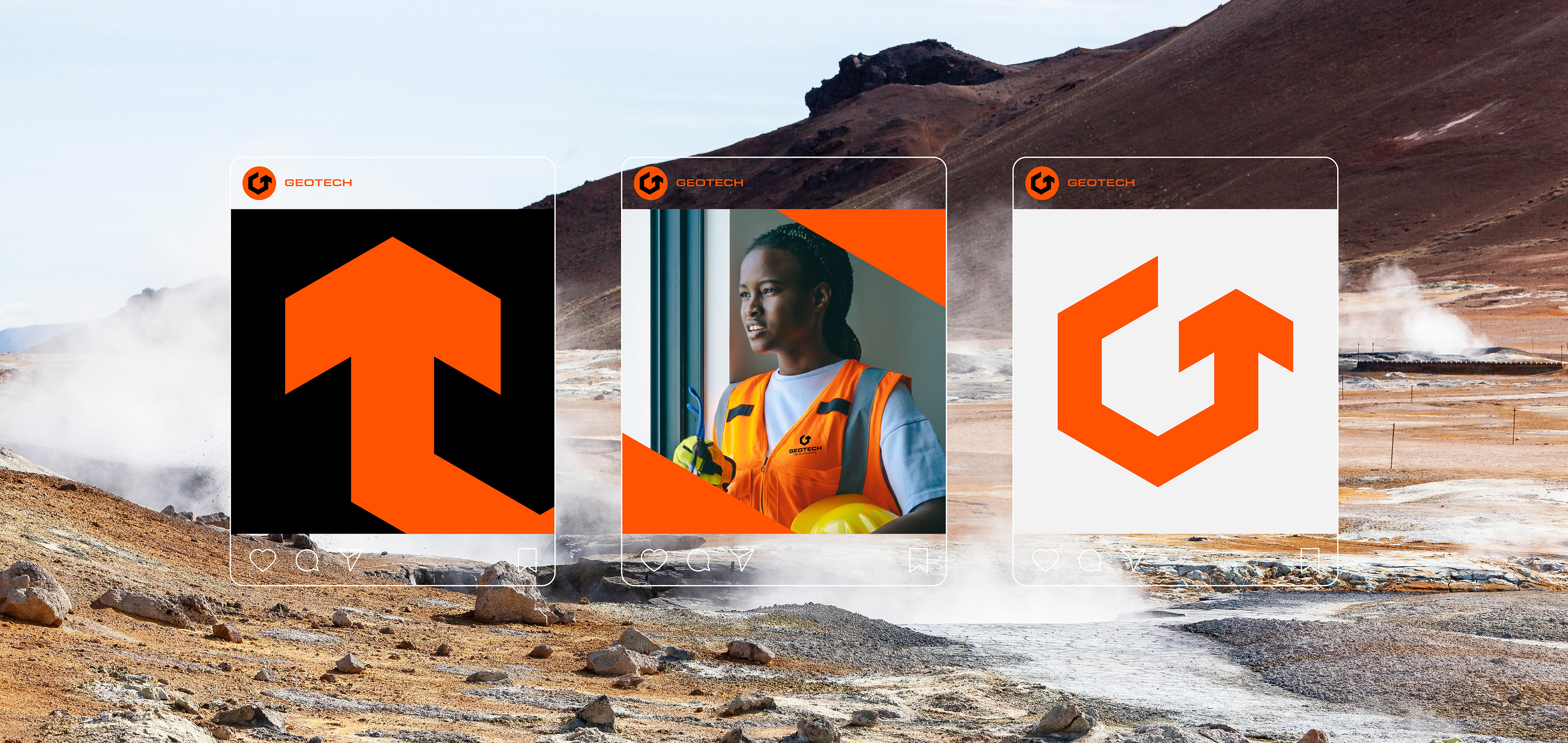
Geotech is a geothermal drilling company that were looking for a new visual identity, mainly including a logomark that is unique and easily recognisable. They wanted to keep their previous colour palette due to brand recognition, however they wanted a clean logomark that encapsulated the circular nature of renewable energy which could be used as part of a responsive logo package.
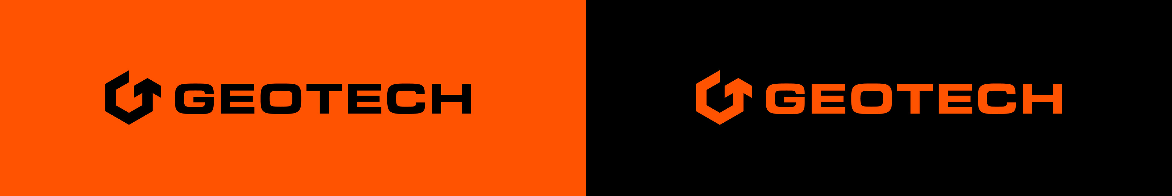
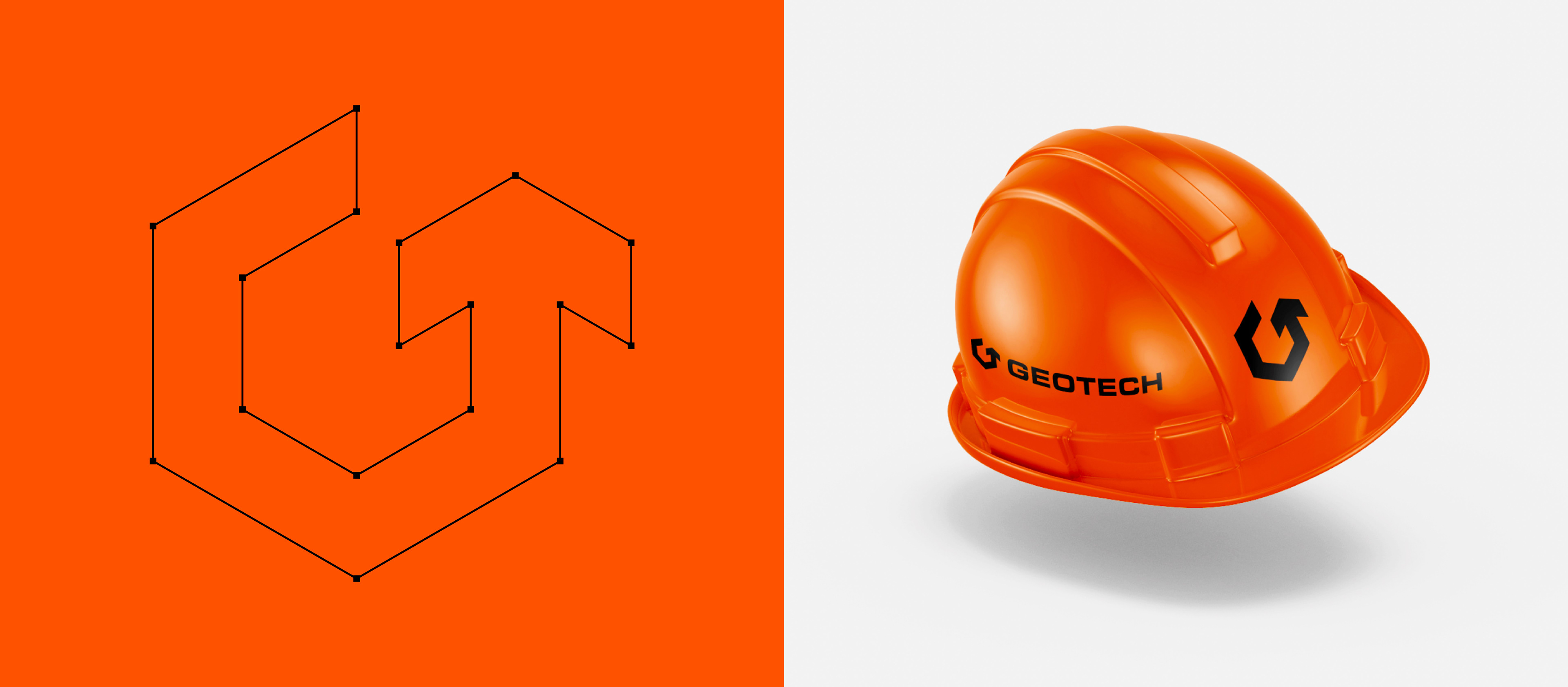
I started sketching ideas in my notebook, and pretty quickly had the idea that if I merged the G and T, I could create an interesting mark whilst also incorporating the letters. The arrowhead signals the constant movement, whilst also acts as the bar for the G and T to complete the logomark. The end result was a logo that looks cutting edge in it's industry, and a visual identity that will stand out next to competitors.