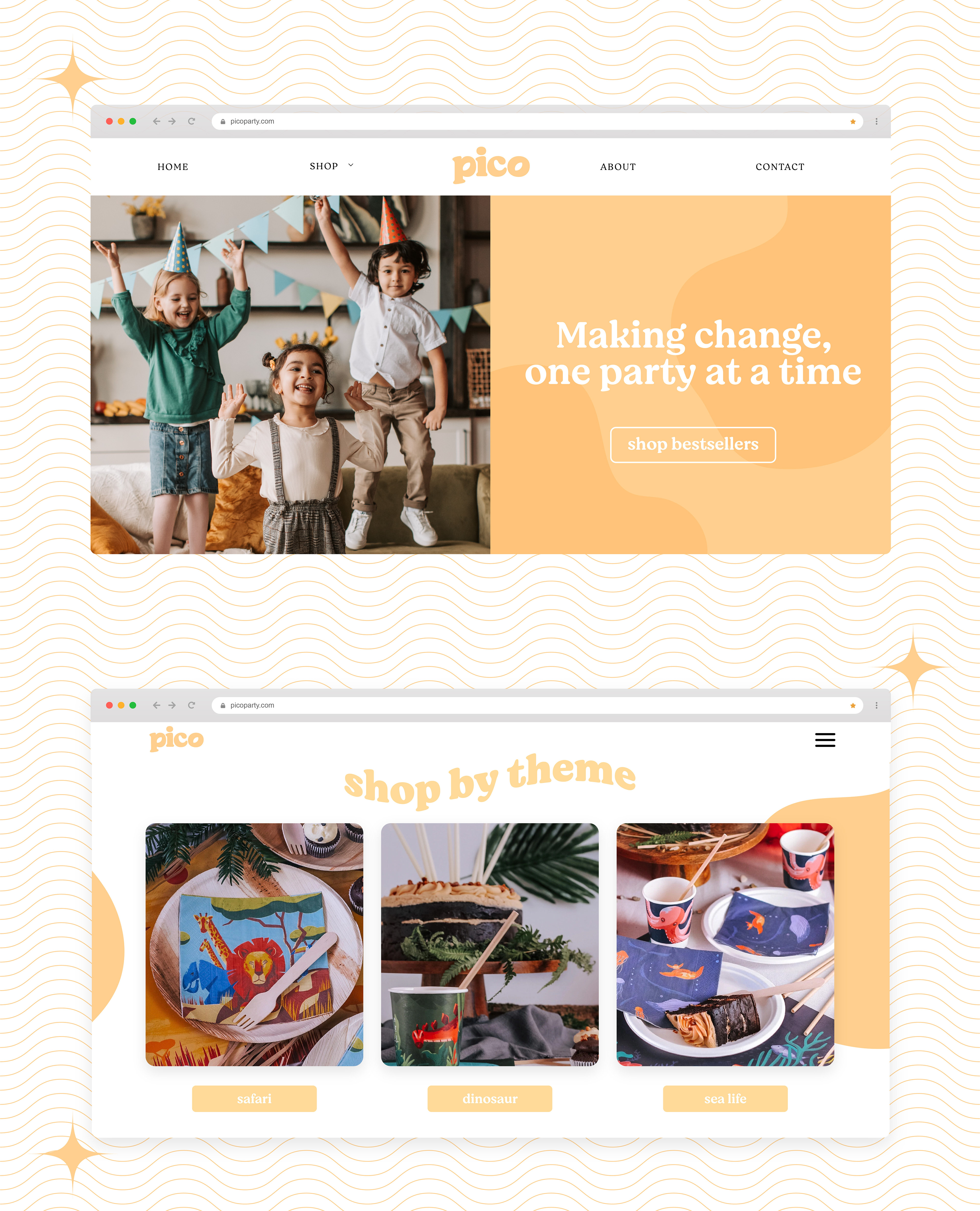
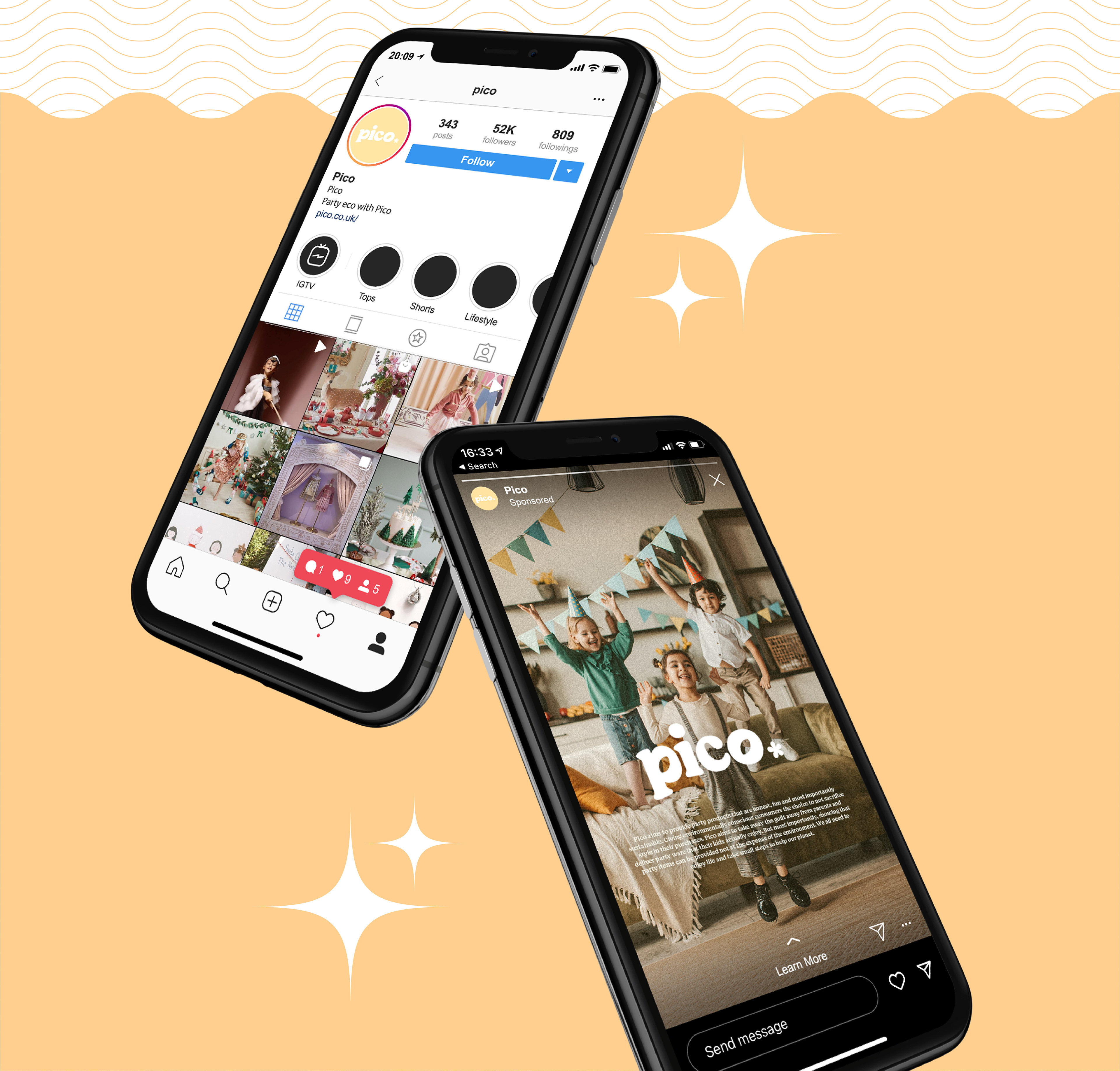
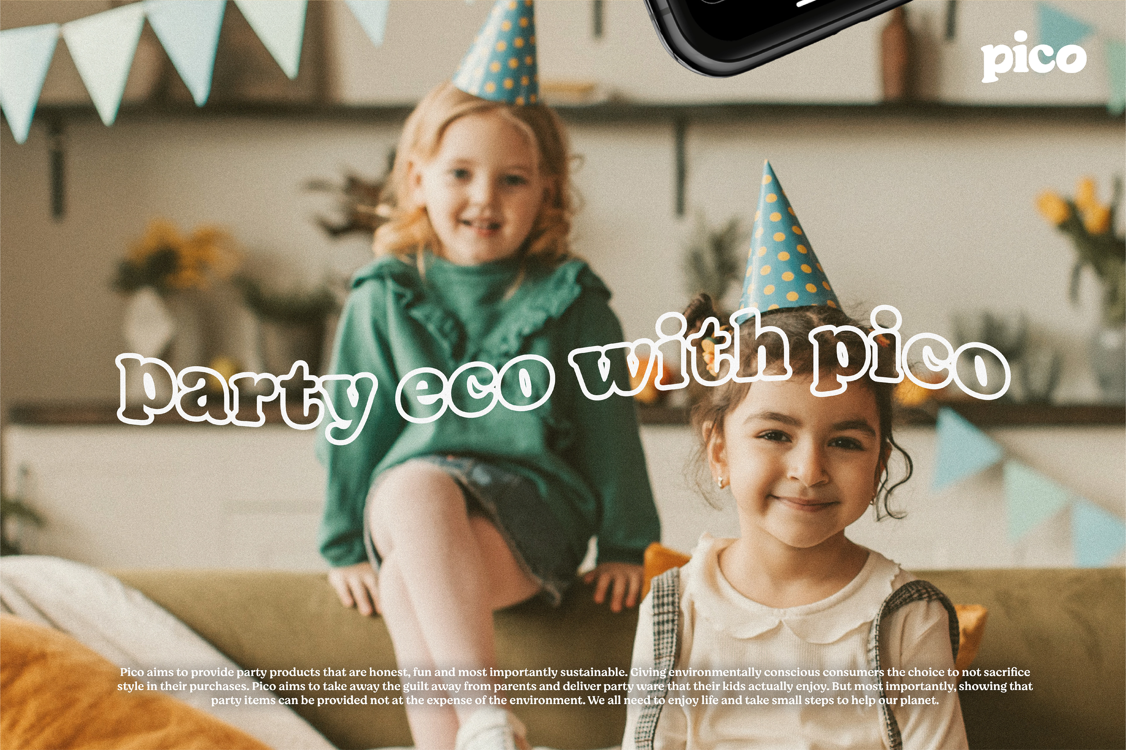
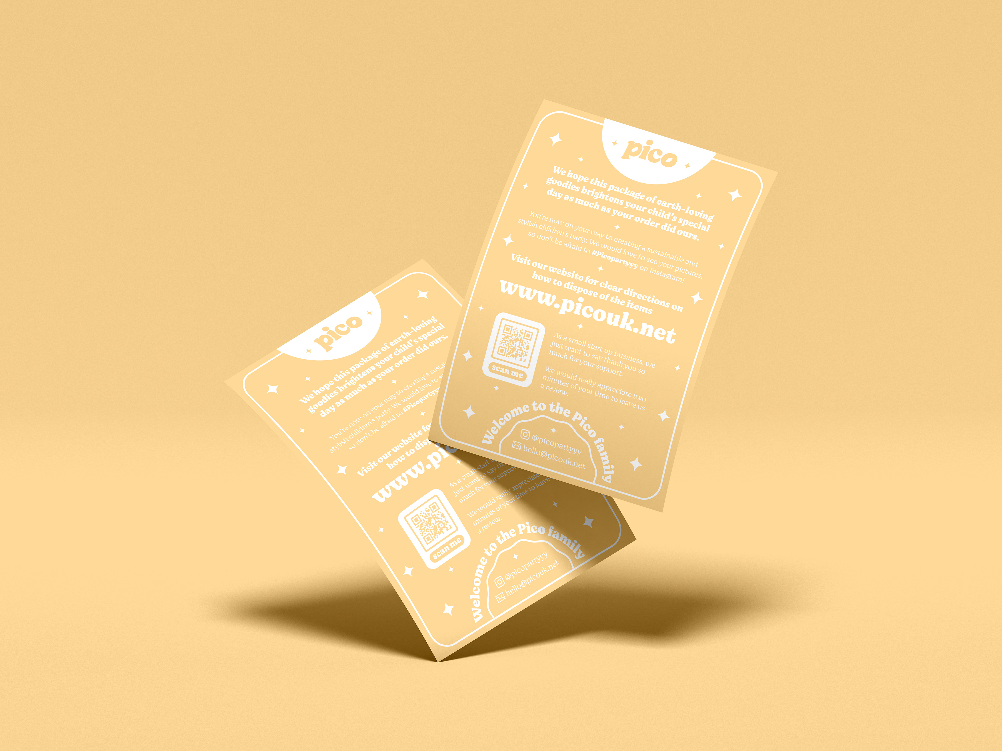
Client: Pico
Scope: Logo design / Branding / Visual identity / Brand guidelines / Web design / Print design
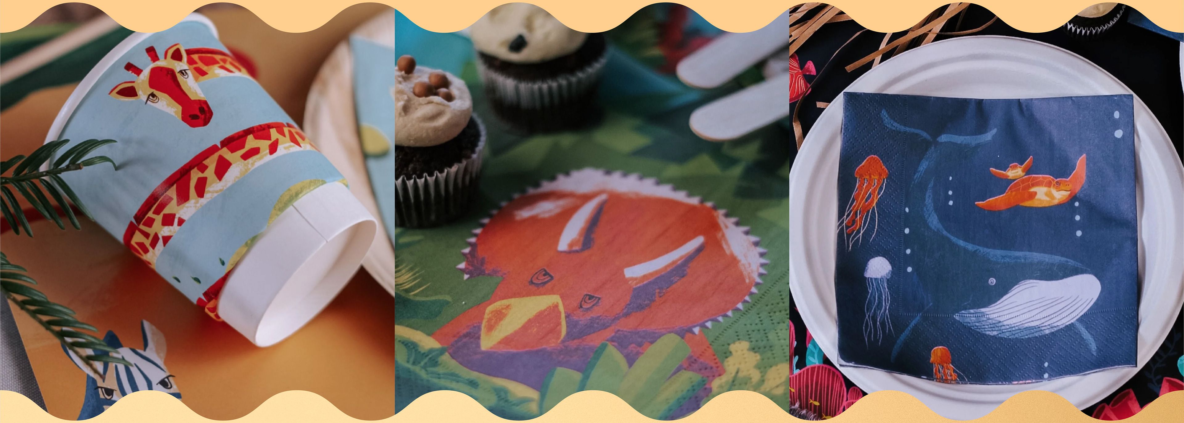
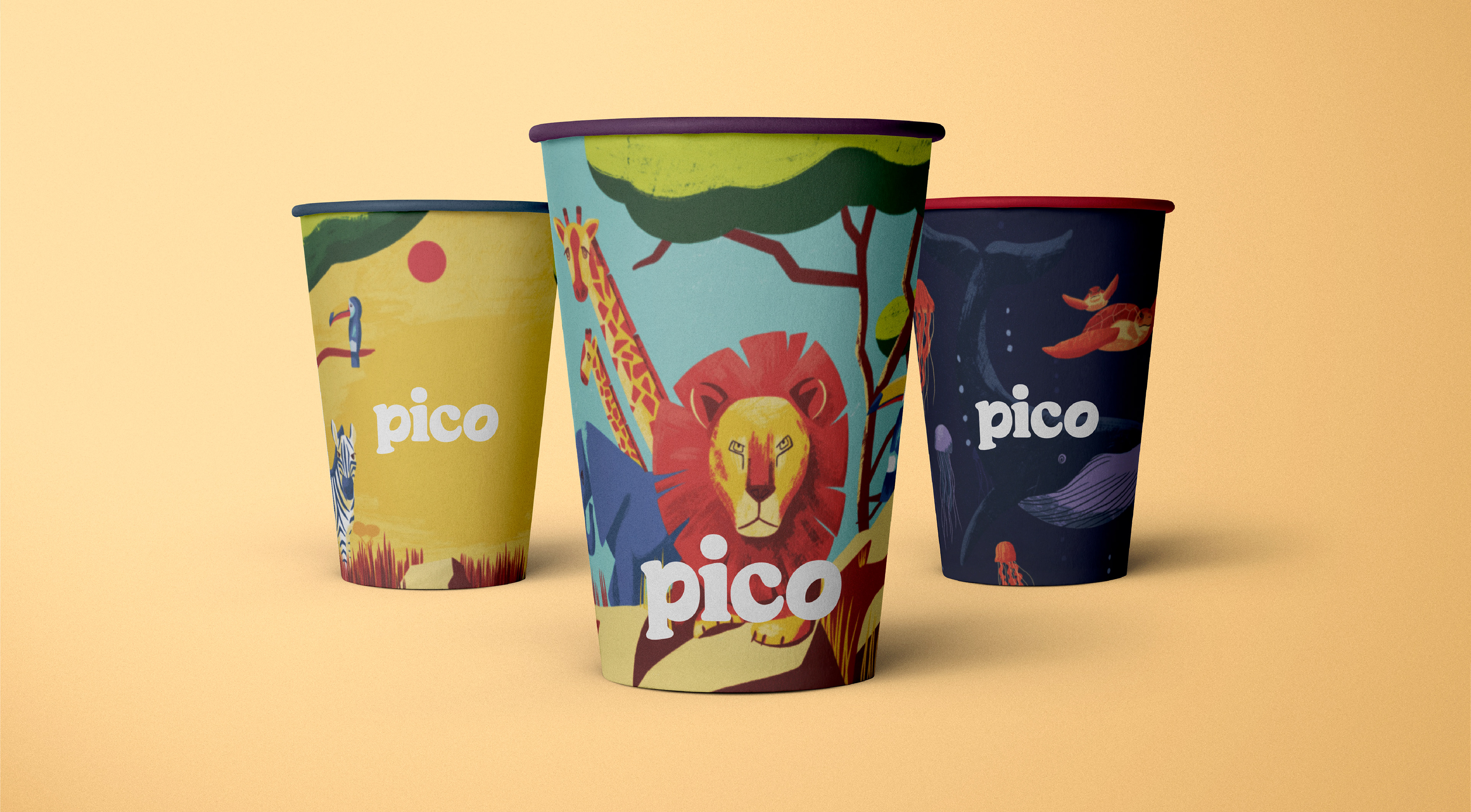
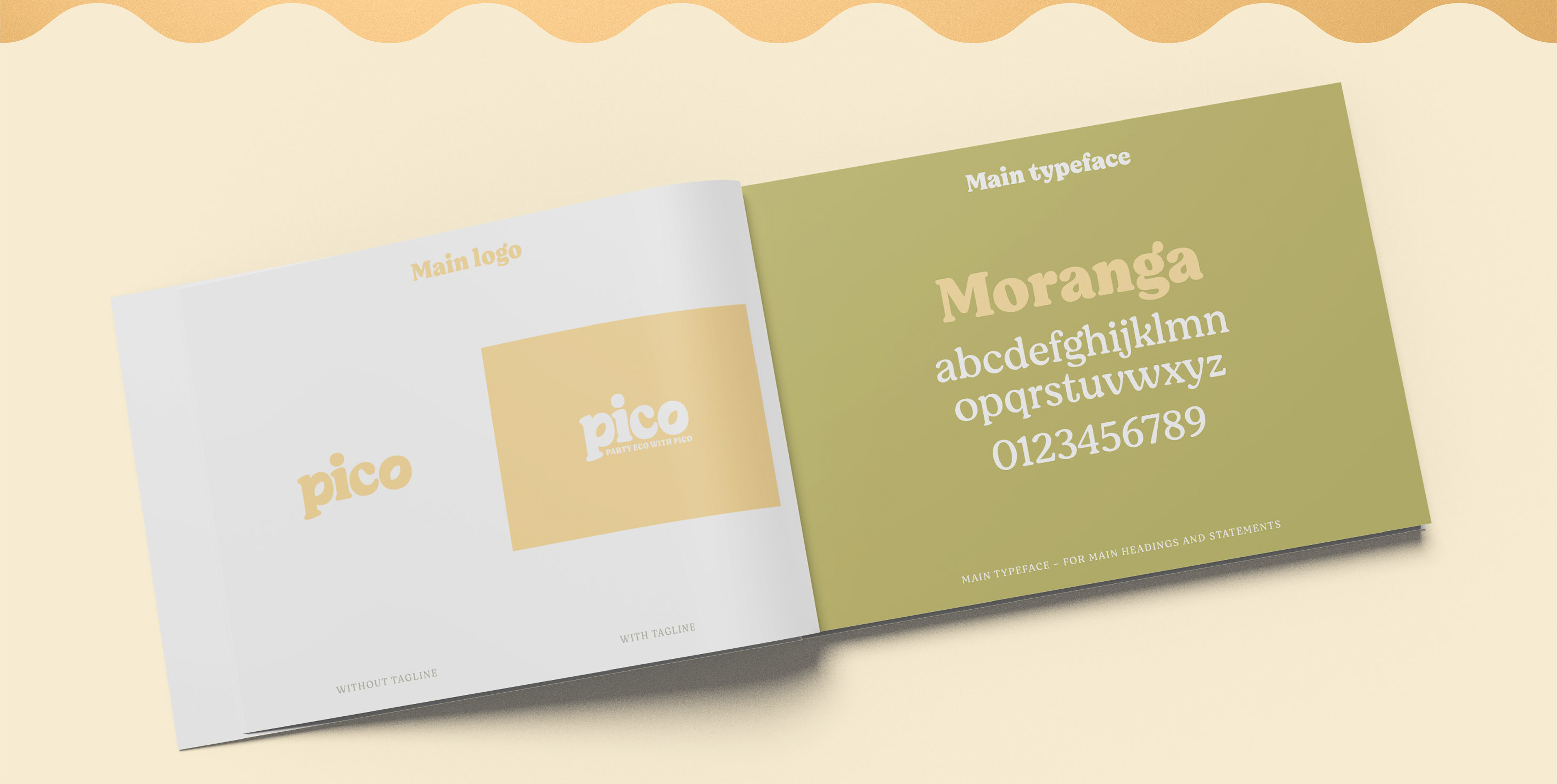
Pico is a start-up company that provides and sells children’s eco-friendly party products via e-commerce platforms. The colour palette was consciously selected to be gender-neutral but also eco-friendly. The typeface evokes a sense of playfulness whilst still appealing to a mature consumer. The subtle use of the leaf shape in the ‘p’ in pico also represents the brand’s sustainability values.