Client: Moorland Properties
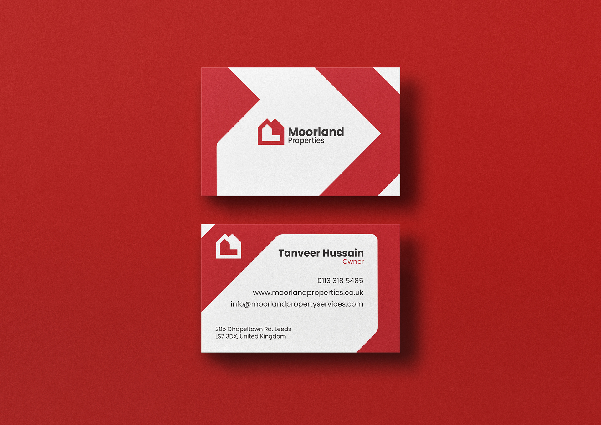
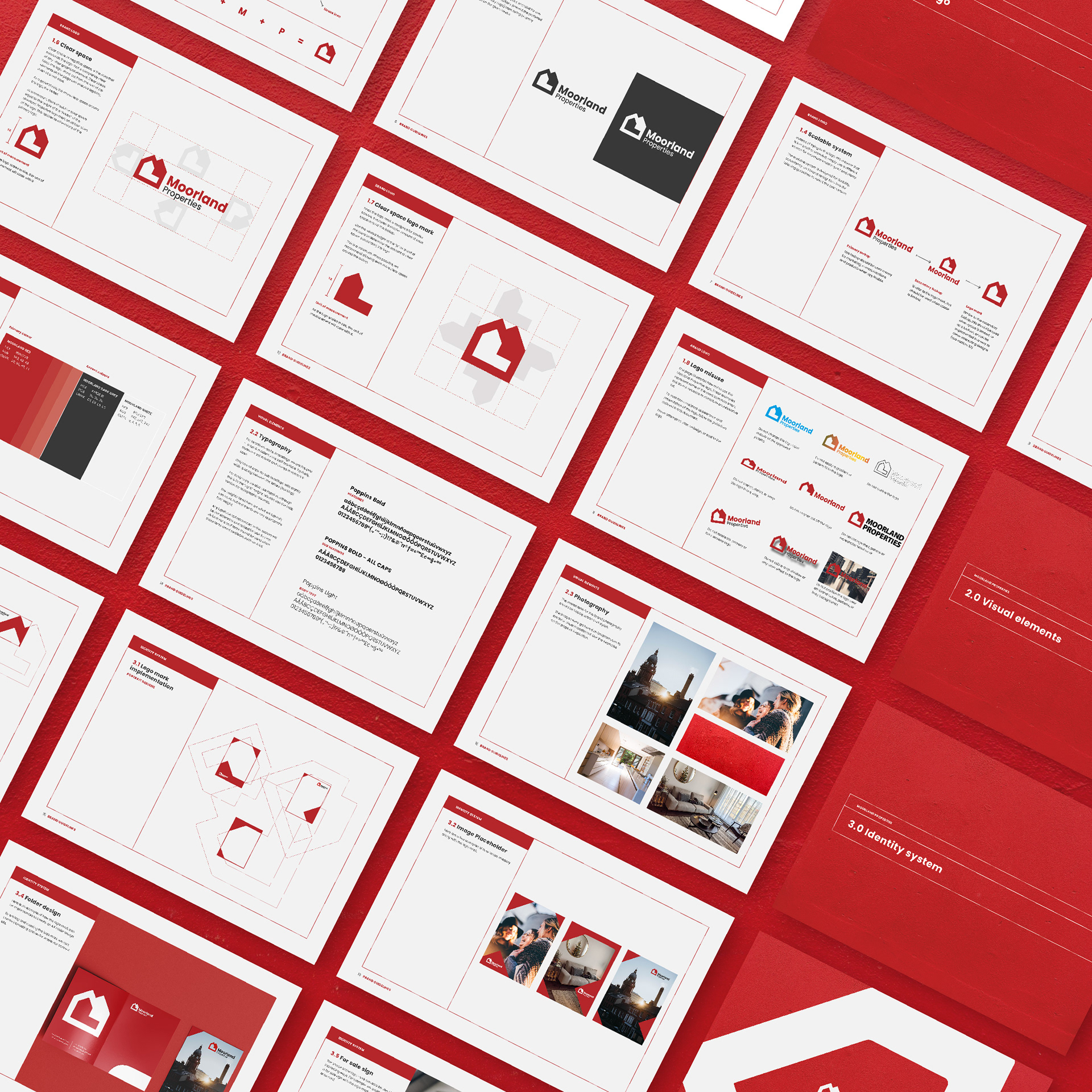
Scope: Logo design / Branding / Visual identity / Brand guidelines / Print design
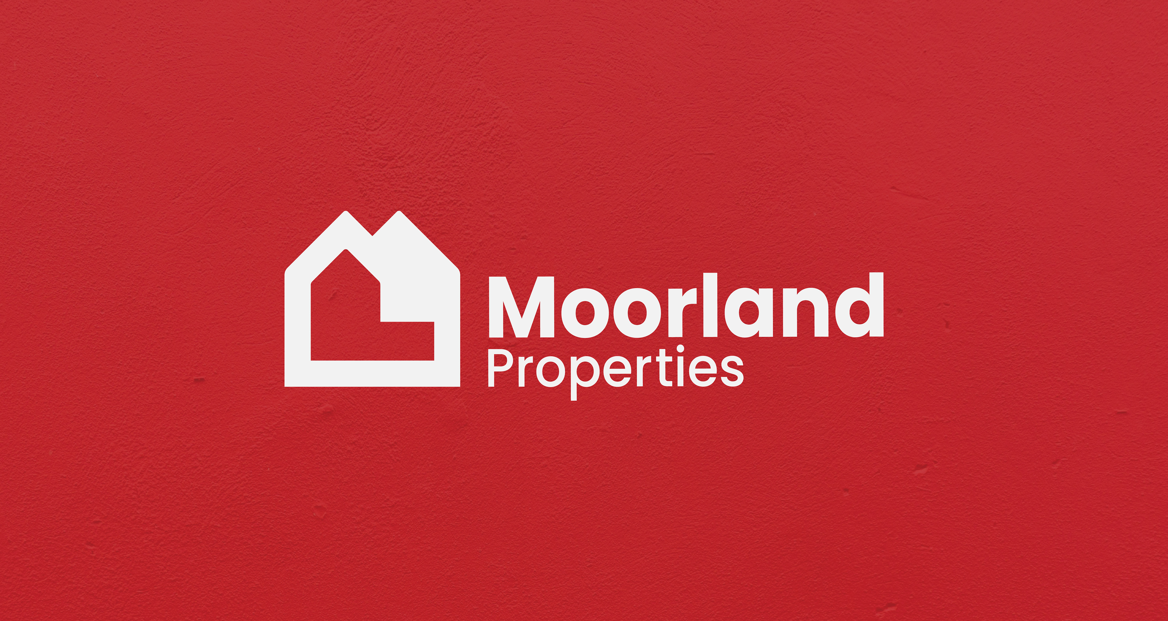
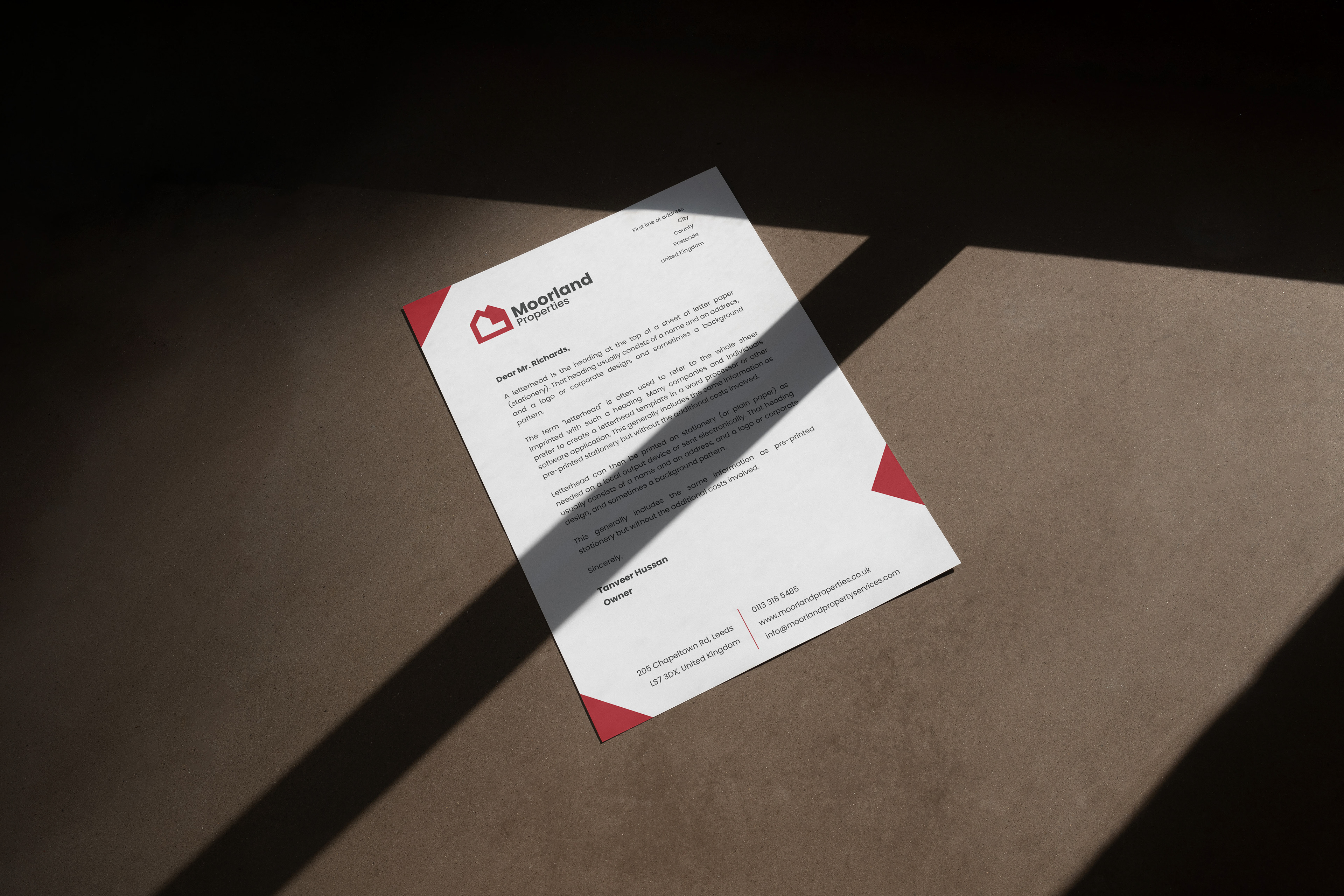
Based in Leeds, UK, Moorland Properties is a real estate company that was seeking a rebrand that included a responsive logo package, brand guidelines and printed materials, the client however wanted to keep the original brand colours which was red, black and white.
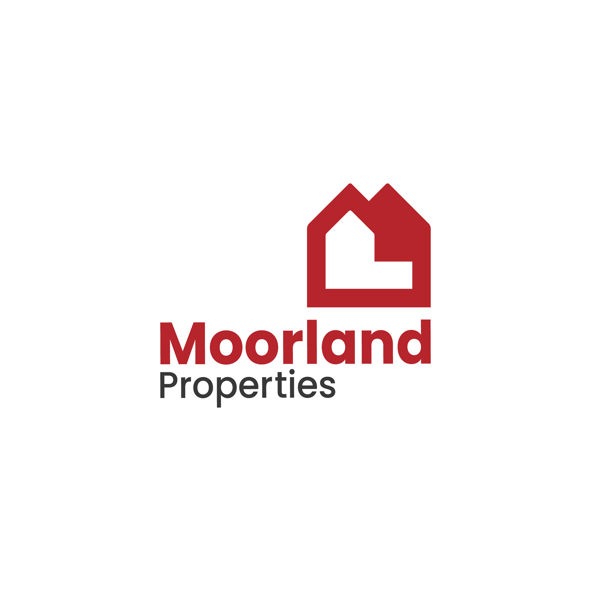
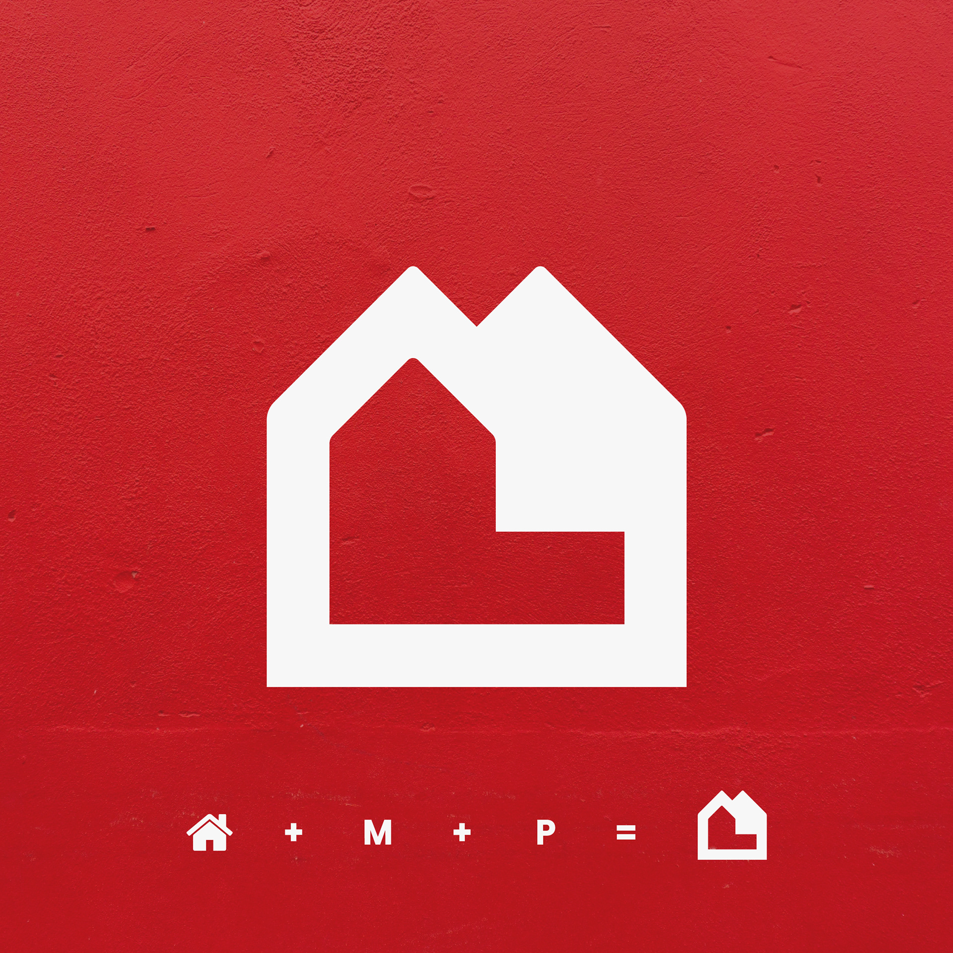
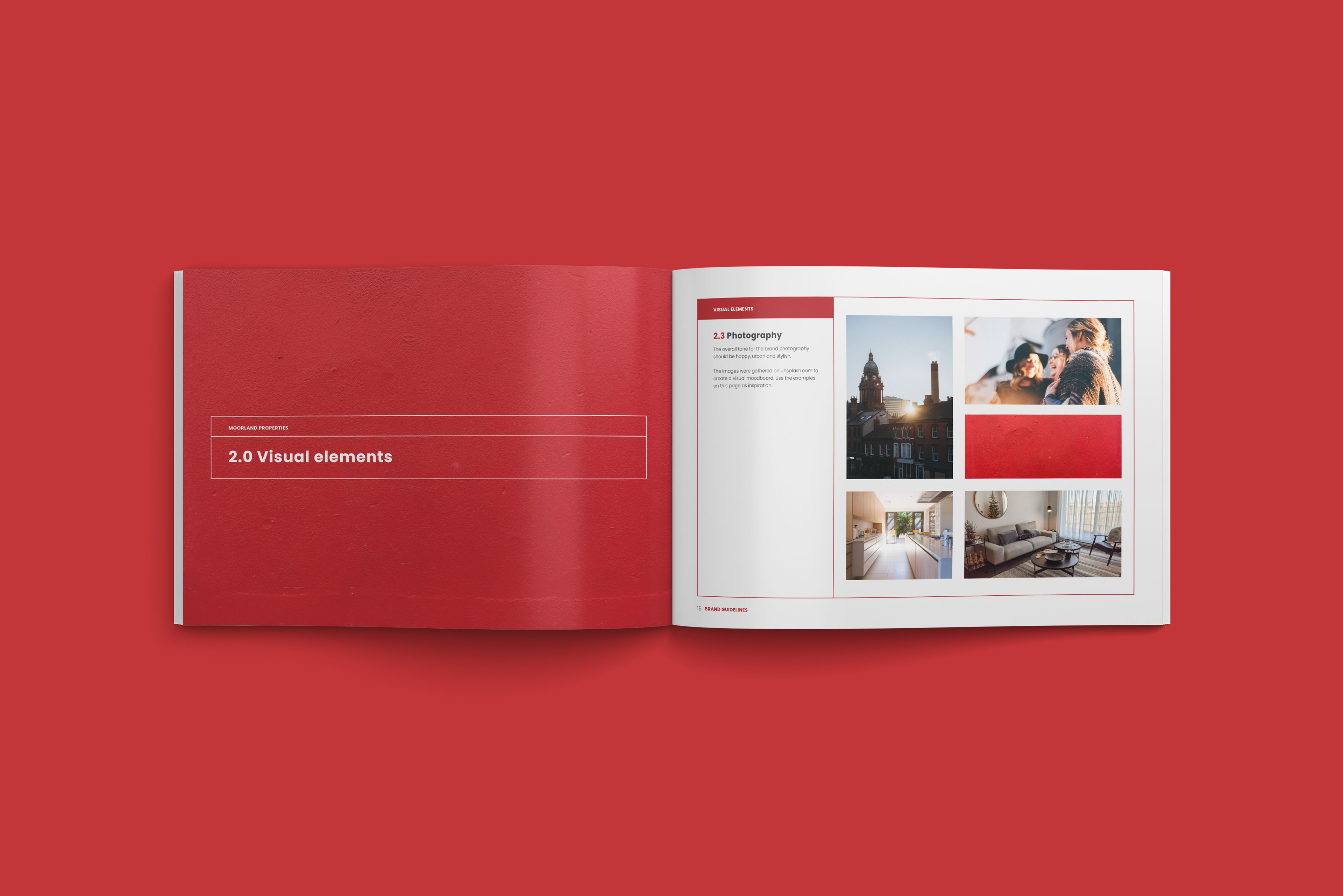
My ultimate goal was to create a unique logomark that would act as the key visual for the brand, by integrating the letters M and P into the shape of a house, I was able to achieve this. The logomark was then used to create engaging designs that could be rotated and scaled onto different mediums, creating totally unique compositions and layouts.
The outcome was a clever responsive logo package, where the logomark did most of the heavy lifting when generating other branded materials.